Category: Brand Studies

  • Brand Study: Apple

    Brand Study: Apple

    Brand Study: Apple

    Observed through a seven-section, descriptive framework


    1. Why This Brand Is Worth Studying

    Apple is worth studying because it became one of the most influential consumer brands in history without competing primarily on price, specifications, or speed to market. Its success reshaped how consumers evaluate technology products and how companies think about design, integration, and brand meaning.

    For small businesses, Apple is useful not as a model to copy, but as a case that shows how coherence and repeated experience can shape identity over time.


    2. The Environment It Entered

    Apple entered consumer technology markets that were already crowded and largely specification-driven. Personal computers were positioned around processing power and compatibility. Mobile phones prioritized buttons, carrier features, and incremental hardware improvements.

    Consumer expectations were low around ease of use. Complexity was accepted as the cost of functionality. Design was secondary to engineering, and ecosystems were fragmented.

    This environment created an opportunity for differentiation, but not an obvious one. Many companies had access to similar components and technologies.


    3. What the Brand Did First

    Apple’s early moves in its most successful eras were not about breadth, but about reframing existing categories.

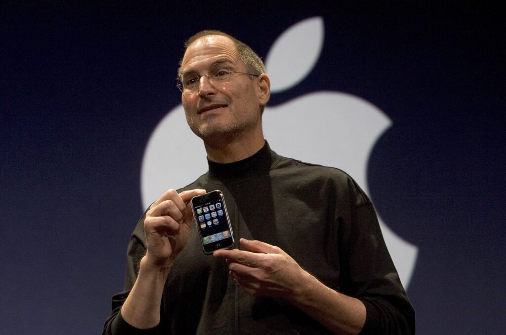
    With personal computers, Apple emphasized interface and usability rather than raw power. With the iPod, it paired hardware with software and content distribution. With the iPhone, it replaced the physical interface of phones with a software-first interaction model.

    These were not new categories. Apple entered established markets with products that behaved differently.


    4. What Actually Drove Early Traction

    Apple’s early traction in each category came from immediate experiential differences rather than abstract claims.

    Users did not need to understand how the products worked internally. The benefits were felt directly:

    • devices were easier to use
    • interactions were more intuitive
    • products felt complete rather than modular

    Marketing helped create awareness, but adoption was driven by word-of-mouth and firsthand experience. Once users interacted with the products, competing alternatives felt cumbersome by comparison.


    5. How the Brand’s Identity Took Shape

    Over time, Apple’s identity emerged through repetition. Across products and years, certain patterns became consistent:

    • emphasis on simplicity
    • control over hardware and software together
    • visual and physical restraint
    • avoidance of unnecessary customization

    These patterns formed expectations. Consumers began to associate Apple with tools that “just work,” even when that came with tradeoffs such as higher cost or reduced flexibility.

    Apple did not define this identity explicitly at first. It became visible through accumulated use.


    6. How the Brand Grew

    Apple’s growth has been marked by selective expansion. The company avoided releasing large numbers of product variants and limited its lineup intentionally.

    Growth came through:

    • extending existing product lines rather than launching unrelated ones
    • building an ecosystem that increased switching costs
    • using retail spaces to control experience and education

    Apple also chose not to compete in many segments it could have entered, such as low-cost hardware or highly modular systems. These decisions reinforced brand clarity but narrowed the addressable market.


    7. Practical Reflections for Small Businesses

    Apple’s case offers several observations that small businesses can think through, without assuming the same outcomes are possible.

    • Apple benefited from controlling the full user experience, which may not be feasible for smaller firms, but clarity of experience often is.
    • The company’s identity emerged from repeated product behavior, not branding statements. Small businesses can observe how their own customers describe them and use that as a guide.
    • Apple did not try to serve every customer. Small operators often face similar tradeoffs and can learn from the discipline of saying no.
    • Marketing amplified Apple’s strengths, but did not replace them. For small businesses, this reinforces the importance of aligning messaging with actual delivery.

    Apple’s trajectory shows that brand identity can form gradually through consistent execution. The lesson is not that simplicity always wins, but that coherence over time creates meaning, even in competitive markets.

  • Brand Study: SBD

    Brand Study: SBD

    Brand Study: SBD

    How one exceptional product became the foundation for a category-defining brand


    Brand Overview

    SBD operates in the highly specialized category of competitive powerlifting equipment. Within this niche, the brand has achieved a level of authority that makes it a default choice for serious lifters. SBD is not a lifestyle brand, nor does it attempt to broaden its appeal beyond the sport it serves. Its relevance is inseparable from competition, rules, and performance under maximal load.

    From a brand-study perspective, SBD is significant because its growth did not originate from broad marketing ambition. It originated from product excellence so clear that the brand followed naturally.


    Market Context

    Powerlifting is an unusually unforgiving market. Equipment is regulated, performance differences are marginal, and trust is earned only through repeated exposure at the highest levels of competition. Unlike mass fitness categories, storytelling alone cannot substitute for functional superiority. Gear must work, repeatedly, under extreme conditions.

    Prior to SBD’s rise, the market contained established players, but few brands had become universally associated with “the best” in any single product category. This created space for a company willing to focus obsessively on solving one core problem better than anyone else.


    Core Value Proposition

    SBD’s value proposition is clarity itself: competition-grade equipment built without compromise.

    The brand does not promise accessibility, versatility, or lifestyle alignment. It promises:

    • precision
    • durability
    • compliance

    Product Strategy: One Product as the Foundation

    SBD’s brand is fundamentally built on the success of its lifting belt. While the company now offers a full suite of powerlifting equipment, its authority originates from this single product.

    The SBD belt differentiated itself through:

    • exceptional leather quality and construction
    • strict manufacturing consistency
    • a proprietary lever locking mechanism that allowed repeatable, secure tightness

    The locking system solved a practical and consequential problem for competitive lifters: achieving maximal bracing with minimal variability between attempts. The belt became trusted not because it was marketed as superior, but because lifters experienced the difference directly.Over time, the SBD belt developed a reputation as one of the best lifting belt in competitive powerlifting.


    Expansion Built on Credibility

    Only after establishing dominance with the belt did SBD expand into adjacent products: knee sleeves, wrist wraps, apparel, and singlets. Importantly, this expansion followed the same principles that defined the original product:

    • competition-first design
    • incremental refinement rather than reinvention
    • adherence to federation standards

    Because the brand’s credibility was already secured, new products were not evaluated as experiments. They were trusted extensions of a proven standard.


    Brand Positioning and Messaging

    SBD’s messaging is restrained and functional. Visuals emphasize real competition settings and elite lifters. Language avoids transformation narratives, lifestyle cues, or emotional exaggeration.

    The brand positions itself not as inspiration, but as infrastructure—a tool that exists to support performance rather than define identity. This restraint reinforces trust and keeps attention focused on the product itself.


    Marketing and Growth Strategy

    SBD’s marketing strategy is inseparable from the sport. Growth is driven by:

    • presence at major competitions
    • federation alignment
    • visible use by elite athletes

    Rather than pursuing broad digital reach, the brand concentrates visibility where legitimacy is established. Social media reinforces this positioning rather than expanding it.

    This approach creates a reinforcing loop: the strongest lifters use SBD; therefore, serious lifters choose SBD.


    Competitive Differentiation

    SBD differentiates itself by not expanding its ambition faster than its credibility.

    Key points of differentiation include:

    • obsessive focus on competition standards
    • refusal to dilute the product line with casual fitness gear
    • consistency in materials, construction, and aesthetics
    • authority derived from performance rather than promotion

    Where competitors may chase broader markets, SBD reinforces its position by staying narrow.


    Risks and Constraints

    SBD’s specialization limits its total market size. Growth is bounded by the scale of competitive powerlifting and by regulatory structures. Additionally, reliance on rule compliance requires ongoing vigilance as standards evolve.

    However, these constraints also protect the brand. They prevent overextension and maintain clarity of purpose.


    Strategic Takeaways: Product-Led Brand Building

    SBD illustrates several principles that extend far beyond powerlifting.

    Exceptional products precede strong brands.
    Marketing can amplify value, but it cannot create it. SBD’s brand exists because the belt solved a real problem better than any alternative.

    Focus compounds credibility.
    By concentrating on one product category and perfecting it, SBD earned trust that later enabled expansion.

    Growth should follow proof, not aspiration.
    SBD expanded only after its flagship product had become the standard. This sequence reduced risk and preserved brand integrity.

    Brands are discovered, not invented.
    SBD did not decide what it wanted to represent in the abstract. Its identity emerged from what the product consistently delivered.

    This pattern is visible across categories. There is no Apple without the iPhone and the MacBook. Those products were transformational in their respective spaces, and the brand followed from that transformation. SBD demonstrates the same logic at a smaller, more disciplined scale.

    The strongest brands are not built by saying more. They are built by making something so good that it speaks for itself.

  • Brand Study: Patagonia

    Brand Study: Patagonia

    Brand Study: Patagonia

    A strategy-focused analysis, with personal context and practical takeaways


    Origin Overview: How Patagonia Started

    Patagonia began not as an apparel brand, but as a tool-making operation for a niche athletic community. The company’s roots trace back to Yvon Chouinard, a climber who initially made reusable steel pitons for rock climbing. These tools were designed to be durable, functional, and better for the rock than disposable alternatives commonly used at the time.

    As climbing culture evolved and environmental damage from traditional pitons became more apparent, Chouinard and his team made a consequential decision: they stopped selling pitons that harmed rock faces and shifted toward alternative gear. This choice came at a financial cost in the short term but reinforced a long-term principle that would later underpin the brand.


    Brand Overview

    Patagonia operates in the outdoor apparel category but occupies a position that extends beyond technical performance. The brand is widely associated with durability, environmental responsibility, and a restrained approach to consumption. From a strategic standpoint, Patagonia is notable because its identity is tightly integrated into how it designs products, communicates with customers, and structures its growth.

    The brand functions as both a clothing company and a values-based organization, and the two are difficult to separate.


    Market Context

    The outdoor apparel market is crowded and highly competitive, with many brands emphasizing innovation, performance metrics, or visual novelty. At the same time, consumers in this category often hold strong beliefs about sustainability, ethics, and environmental impact.

    Patagonia operates within this environment by treating those beliefs not as secondary marketing themes, but as central operating principles. This approach differentiates the brand in a market where functional quality is expected and increasingly commoditized.


    Core Value Proposition

    Patagonia’s value proposition centers on durability, longevity, and responsibility. The brand positions its products as tools meant to be used hard and kept for a long time, rather than replaced frequently.

    This proposition has two dimensions:

    • Functional: products are designed to last and perform consistently
    • Philosophical: reduced consumption is presented as a positive outcome

    Rather than promising perfection, Patagonia emphasizes transparency and intention, which helps maintain credibility even when trade-offs exist.


    Product Strategy

    Patagonia’s product strategy prioritizes durability and repairability over rapid iteration. Designs are conservative and intentionally resistant to trend cycles, which allows products to remain relevant across multiple seasons.

    Programs that support repair and reuse reinforce this strategy by extending product life and strengthening customer trust. From a business perspective, this approach trades short-term volume for long-term loyalty.


    Marketing and Growth Strategy

    Marketing at Patagonia functions primarily as education and alignment rather than persuasion. Content often focuses on environmental issues, activism, and community involvement rather than product features alone.

    Growth is supported through:

    • Mission-driven storytelling
    • Community engagement
    • Retail environments that reinforce brand values
    • Services that extend product life

    This creates a customer base that is less price-sensitive and more values-aligned.


    Message Based Marketing

    One of Patagonia’s most distinctive retail and marketing strategies is its integration of repair and reuse directly into the customer experience. Programs like Worn Wear operate both as a service and as a brand signal.

    From a marketing perspective, repair functions as:

    • Proof of product durability
    • Reinforcement of trust and long-term value
    • A visible rejection of fast-fashion logic

    By offering in-store repairs and resale of used garments, Patagonia turns what would normally be a cost center into a credibility engine. These programs reduce short-term sales volume but strengthen long-term brand loyalty and differentiation.


    Takeaways for Small Businesses

    This section translates Patagonia’s strategy into lessons that apply at a smaller scale.

    Start with a real belief. Patagonia’s brand works because its principles influence actual decisions. Small businesses benefit when values shape operations, not just messaging.

    Let quality signal status. Patagonia demonstrates that restraint and durability can communicate sophistication without relying on trends or logos.

    Educate your customer. Explaining trade-offs, process, or philosophy can build trust more effectively than promotion.

    Accept that clarity narrows the audience. Patagonia does not aim for universal appeal. Small brands often benefit from the same discipline.


    Conclusion

    Patagonia shows that a brand can achieve broad cultural relevance without broad appeal. Its success comes from consistency, restraint, and the integration of values into every layer of the business.

    For small businesses, the lesson is not to replicate Patagonia’s mission, but to adopt its discipline: define what you stand for, apply it consistently, and allow the brand to grow within those boundaries.

  • Brand Study: Alo

    Brand Study: Alo

    Brand Study: Alo

    Marketing strategy, sales model, influence, and differentiation

    Overview

    Alo occupies a distinct position within the athleisure market by approaching apparel not primarily as performance gear, but as a visual and cultural extension of wellness. While competitors often emphasize either technical performance (Lululemon) or everyday versatility (Vuori), Alo focuses on yoga as an aesthetic and identity that can be worn beyond the studio.

    The brand’s growth has been closely tied to its ability to merge fashion, social visibility, and wellness culture into a coherent commercial strategy.


    Financial and Ownership Context

    Alo operates very differently from many of its high-profile competitors in terms of ownership and capital strategy. While the brand is highly visible culturally, it remains privately held and founder-controlled, which has shaped both its growth pace and its marketing behavior.

    Ownership Structure

    Alo is owned by Color Image Apparel, a vertically integrated apparel company based in Los Angeles. Color Image Apparel was founded by Danny Harris and Marco DeGeorge, who continue to play central roles in the brand’s direction.

    This structure is significant because it means:

    • Alo is not venture-backed in the traditional sense
    • There is no public pressure for short-term liquidity events
    • Strategic decisions remain closely tied to founder vision

    Unlike brands that rely on external growth capital, Alo has been able to fund expansion largely through internal cash flow and operational control.


    Marketing Strategy: Wellness as a Visible Identity

    Alo’s marketing centers on the idea that wellness is not only practiced, but displayed. The brand’s campaigns consistently place apparel in highly stylized yoga and lifestyle contexts that translate well across digital platforms.

    Key elements of Alo’s marketing approach include:

    • Strong emphasis on visual content designed for social media
    • Clean, polished imagery that blends fashion and fitness
    • Messaging that aligns yoga with aspiration, balance, and self-improvement

    Rather than framing yoga purely as practice or discipline, Alo presents it as a lifestyle that can be expressed outwardly through clothing.


    Influencer and Celebrity Strategy

    Influencer marketing has been central to Alo’s rise. The brand has been particularly effective at aligning with high-visibility figures who sit at the intersection of wellness, fashion, and celebrity culture.

    Notable figures frequently associated with Alo include:

    • Kendall Jenner
    • Jimmy Butler
    • Hailey Bieber
    • Gigi Hadid

    Also, High-profile yoga instructors and wellness influencers with large digital followings have been key to the brand’s growth.

    These partnerships position Alo not just as studio wear, but as clothing that belongs in everyday public life. The visibility of Alo apparel in non-exercise settings reinforces its fashion-forward appeal.


    Studio-Centric Ecosystem

    Alo differentiates itself by investing heavily in yoga studios and experiential spaces, particularly in major cities. These spaces function as:

    • Practice environments
    • Community hubs
    • Content-generation centers
    • Brand reinforcement tools

    This studio-first strategy deepens the association between Alo and yoga culture while providing highly shareable environments that fuel digital marketing organically.


    Sales Strategy and Distribution

    Alo operates with a strong direct-to-consumer focus, supported by flagship retail locations in high-traffic urban areas. The brand uses frequent product drops and limited-run styles to encourage repeat engagement and urgency.

    Sales drivers include:

    • Trend-responsive collections
    • Coordinated sets that increase average order value
    • Seasonal colorways and silhouettes
    • Strong online-to-retail integration

    Compared to competitors, Alo is more comfortable with fashion-driven cadence, introducing newness at a faster pace.


    Product Differentiation

    Alo’s apparel is designed to balance functionality with style, often prioritizing visual structure and silhouette over technical performance metrics.

    Common product characteristics:

    • Sculpted fits and compression-forward fabrics
    • High-waisted leggings and cropped tops
    • Coordinated sets designed for visual cohesion
    • Materials optimized for studio environments rather than high-impact training

    This approach makes Alo particularly appealing to consumers who value how clothing looks both during and after workouts.


    What Makes Alo Different

    Alo’s primary differentiation lies in how it frames wellness:

    • Wellness as identity, not just activity
    • Yoga as both practice and aesthetic
    • Apparel as a visual signal of lifestyle alignment

    Unlike Lululemon, which emphasizes discipline and performance, or Vuori, which emphasizes comfort and adaptability, Alo emphasizes visibility and style within wellness culture.


    Competitive Positioning (Simplified)

    • Lululemon: technical performance and longevity
    • Vuori: comfort, versatility, everyday movement
    • Alo: fashion-forward yoga and visible wellness

    These distinctions allow Alo to coexist with competitors while appealing to a specific consumer motivation: the desire for wellness to be both practiced and seen.


    Summary

    Alo’s success is driven by a tightly aligned system of visual marketing, influencer partnerships, studio-based experiences, and fashion-forward product design. By embedding itself deeply in yoga culture while amplifying that culture through digital visibility, Alo has built a brand that resonates strongly with consumers who view wellness as part of personal identity.

    Its differentiation is not rooted in technical superiority, but in cultural relevance and aesthetic coherence within the modern wellness landscape.

  • Brand Study: Vuori

    Brand Study: Vuori

    Brand Study: Vuori

    Introduction

    Vuori is a contemporary athletic and lifestyle apparel brand that has grown quickly by positioning itself between technical performance wear and fashion athleisure. Rather than competing solely on sport-specific performance or trend-driven style, Vuori emphasizes comfort, versatility, and everyday wearability. It is part of the broader shift in clothing where consumers seek garments that can function across multiple activities and environments.


    Founding & Backing

    Vuori was founded in 2015 by Joe Kudla in Encinitas, California, drawing on influences from surf, yoga, and coastal lifestyle culture. The company has maintained momentum through a combination of strategic funding and early profitability.

    Institutional investors include SoftBank Vision Fund, Norwest Venture Partners, General Atlantic, and Stripes, which collectively have contributed to over $1.27 billion raised across funding rounds. A late-stage private equity round in 2024 led by General Atlantic and Stripes valued the company at approximately $5.5 billion, significantly above its prior $4 billion valuation.

    Although private financial details (like annual revenue or gross margin) are not publicly disclosed, industry reports indicate Vuori has been profitable since about 2017, unusually early for a venture-backed apparel company. According to investors, the brand operates profitably on both an EBITDA and net basis, and does not rely on capital for basic operations, even as it expands its retail and product footprint.


    What Makes Vuori Different

    Product Philosophy: Versatility First

    Vuori’s approach is defined by clothing that works in multiple contexts rather than for a single sport or performance niche:

    • Everyday movement: Apparel is designed to feel appropriate for light training, walking, travel, errands, and downtime.
    • Soft, substantive fabrics: Vuori tends toward comfort-forward materials with a smooth hand, flexibility in multiple directions, and durability that supports repeated use.
    • Casual aesthetic: Products feature minimal visual signaling and restrained brand marks, allowing clothing to look appropriate across social, active, and relaxed contexts.

    This positioning differs from performance-centric brands that emphasize metrics (e.g., compression, rebound, speed) and from fashion-forward competitors that lean heavily on trend cycles.


    Core Products & Best-Selling Drivers

    While Vuori offers a broad range of apparel, several product categories have been particularly important to growth:

    Men’s Shorts
    Men’s shorts are frequently cited as one of Vuori’s breakout categories. They combine relaxed fit, breathable materials, and a silhouette that adapts to active and casual use alike. Reports and industry commentary suggest men’s products helped Vuori establish a loyal base early, particularly in segments underserved by competitors focused more heavily on women’s performance categories.

    Joggers & Pants
    Vuori’s joggers and casual pants are among its signature items, favored for their balance of softness and structure. These often appear in lifestyle content and retail displays as examples of the brand’s core “move-through-your-day” philosophy.

    Tops & Layering
    Tanks, long sleeves, and lightweight hoodies follow the same comfort-centric pattern but are positioned to broaden the addressable wear occasions, from gym to street.

    Expansion Fabrics
    Vuori’s newer fabric categories (such as BlissBlend™ and DreamKnit™) indicate ongoing investment in material innovation that aims to enhance comfort and fit without sacrificing utility.


    Distribution and Retail Strategy

    Vuori’s sales strategy blends direct-to-consumer (DTC) channels with wholesale placements in stores like Nordstrom and REI, and selectively scaled brick-and-mortar expansion. The company reported operations in around 18 countries and a plan to operate more than 100 stores by 2026, with growth in Europe and Asia underway.

    Stores are designed less as high-pressure retail outlets and more as environments to experience the material and fit, reinforcing the product-led focus of the brand.


    Brand Positioning and Influence

    Unlike some competitors that rely heavily on influencer campaigns, celebrity partnerships, or fast fashion tactics, Vuori’s cultural presence has grown more organically and through lifestyle alignment. Its imagery and messaging emphasize outdoor settings, natural movement, and relaxed living rather than performance hierarchies. While influencer engagement occurs, it is typically with figures who reflect broader lifestyle and movement cultures, rather than overt celebrity endorsement lists.

    Industry sources note that a significant share of Vuori’s customers also buy from Lululemon, with smaller overlap from brands like Alo, indicating that the brand appeals to consumers who value both active function and casual wearability.


    Financial Position & Market Context

    Vuori’s valuation of around $5.5 billion reflects investor confidence in its category position and growth potential. Private equity backing from firms like General Atlantic and Stripes underscores expectations for continued global expansion and product innovation without immediate pressure for an IPO.

    Industry analysis also highlights the broader athleisure sector’s growth trajectory, with the U.S. market expected to grow at approximately a 7% compound annual growth rate through 2028, a trend that supports Vuori’s long-term expansion outlook.


    Summary

    Vuori distinguishes itself through product versatility, comfort-centric materials, and a cultural positioning that melds activewear with everyday lifestyle. Key product drivers like men’s shorts and joggers have helped build a loyal consumer base, while strategic funding and sustainable profitability have enabled measured expansion.

    By avoiding overt sport categorization and prioritizing “wear-everywhere” utility, Vuori occupies a distinct space between performance labels and fashion athleisure, which has supported its rapid rise in a competitive market.

  • Brand Study: Lulu Lemon

    Brand Study: Lulu Lemon

    Brand Study: Lululemon

    Introduction

    Lululemon is a useful case study in how a brand can scale from a narrowly defined product into a global lifestyle company without abandoning its original positioning. The company did not begin as a general athletic brand, nor did it rely on trend-driven fashion cycles. Instead, it entered the market with a single, premium product category and expanded only after establishing credibility through quality and consistency.

    Understanding Lululemon’s success requires looking less at marketing tactics and more at how product decisions, pricing discipline, and community integration reinforced one another over time.


    Origins: A Narrow Entry Point

    Lululemon initially focused on premium women’s yoga leggings. At the time, this was a relatively underserved niche. Athletic apparel tended to prioritize performance over comfort, while fashion-oriented options often sacrificed durability and function. Lululemon positioned itself between these extremes by emphasizing technical fabrics, fit, and long-term wear.

    The decision to start with leggings was strategic. It allowed the brand to solve a specific problem for a clearly defined user group, rather than attempting to appeal broadly. This narrow focus reduced complexity and made it easier for early customers to understand what the brand stood for.


    Premium Pricing as Positioning

    From its earliest days, Lululemon priced its products at a premium and maintained that position consistently. Rather than using discounts to drive adoption, the company relied on product experience to justify cost. Over time, this approach trained customers to associate the brand with reliability and durability rather than promotional value.

    Premium pricing functioned as a form of positioning rather than exclusivity. It filtered for customers who were willing to invest in quality and use, which aligned with the brand’s emphasis on practice, repetition, and routine. Importantly, Lululemon avoided the common pattern of lowering prices to gain scale and then attempting to raise them later.


    Product Quality and Brand Trust

    As Lululemon expanded into additional categories—tops, outerwear, men’s apparel, and casual wear—the brand benefited from the trust established by its initial product. Customers were more receptive to these expansions because they had direct experience with the durability and performance of earlier purchases.

    This trust reduced the perceived risk of buying new categories from the same brand. Expansion felt incremental rather than speculative. The company did not rely on aggressive rebranding or sub-brands to justify growth; it relied on continuity of standards.


    Community-Led Growth

    One of Lululemon’s most distinctive strategies was its early focus on local community engagement. Rather than relying on large-scale advertising, the brand worked with yoga instructors, trainers, and movement leaders who already held influence within their communities.

    In-store classes and events served multiple functions. They introduced customers to the product in context, reinforced the brand’s association with movement and wellness, and positioned retail locations as community spaces rather than transactional environments. This approach created organic word-of-mouth growth and strengthened local relevance without requiring mass-media spend.


    Retail as an Extension of the Brand

    Lululemon stores were designed to support the brand’s broader positioning. Layouts are open and calm, product displays are minimal, and staff are trained to focus on use and fit rather than volume sales. This reinforces the idea that the brand prioritizes long-term satisfaction over immediate conversion.

    Retail, in this context, functions as an extension of the product experience. It provides education, reinforces values, and maintains consistency between brand promise and customer interaction.


    Design Restraint and Visual Consistency

    Visually, Lululemon has maintained a restrained design language. Logos are understated, color palettes are controlled, and seasonal changes are evolutionary rather than disruptive. This consistency supports recognition without relying on overt branding.

    Design restraint also reduces dependency on trends, allowing products to remain relevant across longer time horizons. In a category often driven by rapid aesthetic shifts, this approach contributes to durability and repeat purchase behavior.


    Expansion Without Identity Loss

    As the company grew globally, it resisted repositioning itself as a fashion brand or a general sportswear company. Expansion remained anchored to movement, comfort, and longevity. New categories were introduced only when they could be integrated into this framework.

    This disciplined approach limited brand drift and preserved coherence as scale increased. Growth was additive rather than transformational.


    Summary

    Lululemon’s success can be traced to a series of aligned decisions: starting with a narrow product focus, maintaining premium pricing discipline, prioritizing product quality, and embedding the brand within real-world communities. Marketing amplified these choices, but it did not substitute for them.

    The result is a brand that scaled gradually while retaining a clear identity. Lululemon demonstrates that in consumer categories where trust and repeat use matter, consistency and restraint can be more effective than speed or novelty.

  • Brand Study: Peloton

    Brand Study: Peloton

    Brand Study: Peloton

    Peloton

    Building a Fitness Operating System

    What’s most impressive about Peloton isn’t a single product.
    It’s the integration.

    Peloton has quietly built something closer to a fitness operating system than a bike company: hardware, software, content, apparel, accessories, community, and financing—stitched together into one seamless experience. You don’t just buy a bike. You enter Peloton.


    One Platform, Many Entry Points

    Peloton now offers:

    • Bikes (Bike, Bike+)
    • Treadmills
    • A row machine
    • Shoes and apparel
    • A deep content library (cycling, strength, running, yoga, mobility)
    • A unified app experience across devices

    From a user’s perspective, this creates a powerful psychological effect: one brand for all workouts. No piecing together equipment, apps, or programming. Peloton positions itself as the default.

    That “one-stop shop” feeling is intentional—and hard to replicate.


    Pricing: Hardware Is the Door, Subscription Is the Engine

    Peloton’s flagship Bike+ currently starts at $2,695 . But the real business is ongoing.

    • All-Access Membership (equipment owners): $49.99/month
    • App-only tiers exist at lower price points (e.g., App+) for users without hardware

    This model reframes value:

    • Hardware = entry ticket
    • Subscription = compounding relationship

    It’s not “expensive equipment”; it’s membership into a platform.


    Financing: A Conversion Engine (Even If You Hate Debt)

    Peloton prominently offers monthly financing through Affirm, often advertising $0 down and low or promotional APRs (terms vary) .

    From a consumer-finance ethics lens, it’s fair to be skeptical.
    From a business lens, it’s undeniably effective.

    Embedded financing:

    • Lowers perceived price friction
    • Expands the addressable market
    • Keeps checkout contained within Peloton’s flow

    Peloton isn’t acting as a bank; it’s surfacing financing at the exact moment of desire, which materially boosts conversion.


    Public Company Reality Check

    Peloton is a publicly traded company (NASDAQ: PTON) , and its recent years have been about transition.

    • FY2025 revenue: ~$2.49B
    • FY net loss: around -$118.9M reported in summaries
    • Turnaround indicators: Reuters reported raised FY2025 adjusted EBITDA guidance to $300M–$350M amid cost discipline and subscription focus
    • Cash flow: Q1 FY2026 showed positive operating cash flow and free cash flow

    The strategic direction is clear: less hardware dependence, more platform economics.


    Design: Why Peloton Feels “Apple-Like”

    Peloton’s design does heavy lifting:

    • Clean product pages
    • Consistent typography and photography
    • Retail spaces that feel like consumer tech showrooms

    Complexity is hidden. The user experiences clarity, not choice overload. That’s why Peloton feels premium even when competitors undercut on price.


    Who Shapes the Creative?

    Peloton doesn’t rely on a single agency, but notable partners have shaped key campaigns:

    • Special Group London on global creative like “Find your push. Find your power”
    • Stink Studios on repositioning and digital experiences

    The takeaway: Peloton invests in world-class creative partners to reinforce its platform narrative, not just to sell products.


    Peloton, AG1, and WHOOP

    Peloton shares a strategic DNA with AG1 and WHOOP.

    Shared Principles

    1. Subscription is the core business
      • Peloton: $49.99/mo All-Access
      • AG1: $79/mo subscription vs $99 one-time purchase
      • WHOOP: membership-first model with hardware bundled into plans
    2. “One decision” positioning
      • Peloton replaces gym + trainer + programming
      • AG1 replaces a shelf of supplements
      • WHOOP replaces fragmented fitness tracking
    3. Identity and community
      These brands don’t just sell utility—they sell belonging.

    The Core Insight

    Peloton’s real product is integration.

    By controlling hardware, software, content, retail, and financing, Peloton reduces friction at every step and increases lifetime value through habit and identity.

    You don’t assemble a fitness stack.
    You join Peloton.


    What Builders Can Learn

    • Build platforms, not products
    • Hide complexity behind clean design
    • Use financing strategically (with eyes open)
    • Make the subscription feel inevitable, not optional
    • Create a brand people enter, not just buy
  • Brand Study: AG1

    Brand Study: AG1

    Brand Study: AG1

    Introduction

    AG1 represents one of the most disciplined executions in modern wellness branding. In a crowded supplement market defined by complexity, aggressive claims, and constant SKU expansion, AG1 succeeded by doing the opposite: simplifying the product, narrowing the message, and investing deeply in trust-based media.

    What makes AG1 particularly compelling is not just its growth, but how it achieved it—through focus, repetition, and alignment between product, pricing, and marketing strategy.


    Single-SKU Focus as a Growth Lever

    One of AG1’s defining strategic decisions is its commitment to a single flagship product. Rather than expanding into multiple formulas or adjacent supplements, AG1 concentrated its efforts on refining and promoting one core offering.

    This single-SKU strategy creates:

    • Clear brand identity
    • Simplified messaging
    • Operational efficiency
    • Reduced customer confusion

    From a marketing perspective, this focus allows every campaign, partnership, and piece of content to reinforce the same narrative. Customers never have to ask which product is right for them—AG1 is the product.

    This clarity compounds over time and is a major reason the brand has been able to scale without dilution.


    Product Simplicity & Daily Ritual

    AG1’s formulation may be complex, but its usage is intentionally simple: one scoop, once a day. This simplicity positions AG1 as a baseline habit rather than a performance enhancer or short-term fix.

    By framing the product as foundational, AG1 avoids competing directly with niche supplements and instead becomes the starting point for health-conscious consumers. This reduces friction at adoption and increases consistency—two critical drivers of long-term retention.

    In wellness, consistency beats intensity. AG1 understands this.


    Subscription Model & Habit-Based Stickiness

    AG1’s subscription-first model reinforces its positioning as a daily ritual. Automatic replenishment removes the need for repeat purchase decisions and shifts the relationship from transactional to ongoing.

    This model supports:

    • Predictable recurring revenue
    • Higher lifetime value
    • Stronger behavioral lock-in

    Once AG1 becomes part of a morning routine, the cost of switching is no longer financial—it is behavioral. This is true product stickiness, driven by habit rather than incentives.


    Podcast Advertising & Trust at Scale

    AG1 was one of the earliest wellness brands to fully commit to podcast advertising at scale. The brand sponsored some of the largest and most influential shows in the world, including The Joe Rogan Experience, as well as Tim Ferriss, Huberman Lab, and others.

    In March 2022 alone, AG1 reportedly spent over $2.7 million on podcast sponsorships, with shows like Joe Rogan reaching approximately 11 million listeners per episode. Sponsorship at this level guarantees reach—but more importantly, it guarantees context.

    Podcast ads allow for long-form explanation, repetition, and personal endorsement. AG1 leveraged this format to educate rather than persuade, embedding itself into trusted conversations instead of interrupting them.


    Influencer Strategy: Alignment Over Reach

    AG1’s influencer strategy prioritizes credibility and lifestyle alignment over raw audience size. The brand works with creators who already embody routine-driven, health-conscious living—and often already used the product before formal partnerships.

    This approach produces content that feels observational rather than promotional. AG1 shows up in real morning routines, kitchens, and daily habits, reinforcing its identity as a staple rather than a trend.

    AG1 further strengthens this strategy through custom landing pages tied to specific influencers and podcasts, increasing relevance and conversion while preserving trust.


    Media Company Mindset & User-Generated Content

    AG1 operates like a media company more than a traditional supplement brand. Its marketing ecosystem spans podcasts, social platforms, influencer channels, and large volumes of user-generated content.

    Much of AG1’s strongest social presence—particularly on TikTok and Instagram—comes not from the brand itself, but from customers and creators documenting their routines. This organic content often outperforms paid ads because it reflects lived behavior rather than scripted messaging.

    Paid media fuels organic media. Organic media reinforces trust. The loop compounds.


    Direct-to-Consumer Control & Premium Positioning

    AG1 maintains tight control over its distribution by prioritizing direct-to-consumer channels and limiting third-party marketplace exposure. This allows the brand to:

    • Control pricing and brand presentation
    • Own customer data
    • Personalize onboarding and retention flows
    • Defend its premium positioning

    In a category vulnerable to commoditization, this control is a strategic advantage.


    Synthesis: Why AG1 Works

    AG1 succeeds because every part of the business reinforces the same core idea: health is built through consistent, daily habits.

    Single-SKU focus creates clarity. Subscription pricing reinforces routine. Podcast advertising builds trust at scale. Influencer alignment preserves credibility. Media-first thinking turns users into advocates.

    AG1 does not rely on urgency, novelty, or constant expansion. It earns loyalty through repetition, simplicity, and discipline—qualities that compound over time.


    Data Callout: AG1 at a Glance

    Brand: AG1 (formerly Athletic Greens)
    Business Model: Direct-to-consumer, subscription-first
    Product Strategy: Single SKU
    Estimated Valuation: ~$1.2 billion
    Podcast Ad Spend: ~$2.2–$2.7 million per month (peak periods)
    Key Channels: Podcasts, influencer marketing, UGC, DTC website
    Core Strength: Habit formation through trust-based media


    Core Marketing Principles from AG1

    • Focus scales better than expansion
    • Subscriptions reinforce habits, not just revenue
    • Trust-based media outperforms interruption advertising
    • Influencer alignment matters more than follower count
    • Simplicity increases adoption in complex categories

    Marketing Concept Callout (Reusable)

    Marketing Concept: Habit-Based Brand Stickiness

    Definition:
    A habit-based brand embeds itself into daily routines by reducing friction, simplifying decisions, and reinforcing consistent behavior over time.

    AG1 in Practice:

    • One product removes choice overload
    • Subscription removes repurchase friction
    • Podcasts normalize daily use through repetition
    • Influencers model real-world integration

    Why It Works:
    When a product becomes part of a routine, it stops competing on price or features and starts competing on disruption. The harder it is to replace, the stronger the brand relationship becomes.

  • Brand Study: WHOOP

    Brand Study: WHOOP

    Brand Study: WHOOP

    Brand Study: WHOOP

    Introduction

    For many years, WHOOP has stood out to me as a brand that consistently executes at a high level. From product design and UI to pricing, positioning, and media strategy, the brand demonstrates an uncommon degree of clarity and restraint. Every decision feels intentional, shaped by a deep understanding of both the product and the audience it serves.

    What makes WHOOP particularly compelling is not any single feature, but the way its technology, branding, and marketing align to support one clear goal: helping users understand and improve their performance through precise, trustworthy data.


    Audience Focus & Brand Positioning

    WHOOP was originally designed for athletes, and its early adoption within the CrossFit and elite training communities reinforced this positioning. The brand spoke directly to individuals who valued recovery, readiness, and long-term performance over aesthetics or step counts.

    Over time, WHOOP has begun expanding toward a broader health and wellness audience, emphasizing sleep quality, cardiovascular metrics, and recovery as foundational health indicators. Importantly, this expansion has not abandoned the brand’s original seriousness. Instead, WHOOP has widened its relevance while preserving credibility—an example of thoughtful evolution rather than reactive rebranding.

    This ability to grow without dilution reflects a strong internal understanding of who the product is for, and why it exists.


    Design Philosophy: Precision Through Restraint

    WHOOP’s design language is intentionally understated. The band is minimal. The hardware avoids flash. The absence of a screen is not a limitation, but a deliberate choice that reinforces focus and reduces distraction.

    This design philosophy reflects WHOOP’s positioning as a data company first, not a hardware company. The product’s value does not live in the device itself, but in the insights generated over time. The band is meant to be “cool and invisible,” allowing users to engage with data when it is useful, not when it demands attention.

    Across both hardware and software, restraint signals confidence. WHOOP does not compete for attention; it assumes commitment.


    UI & Product Experience

    The app experience is where WHOOP’s precision becomes most apparent. Rather than overwhelming users with metrics, the platform distills complex physiological data into a small number of meaningful indicators—recovery, strain, and sleep.

    These metrics are designed to gain value through consistency. The longer the user engages, the more accurate and useful the insights become. This creates a natural feedback loop: understanding improves with use, and use increases because understanding improves.

    The result is a product that rewards discipline and long-term thinking rather than novelty.


    Pricing Strategy, Stickiness & Retention

    From a sales and marketing perspective, WHOOP’s subscription model is central to its success. By lowering the upfront cost of entry, the brand reduces friction and allows users to experience the full product ecosystem without a significant initial commitment.

    This approach prioritizes habit formation over one-time conversion. Once users begin building longitudinal data, the product becomes increasingly sticky. Leaving WHOOP means abandoning accumulated insight, context, and self-knowledge—not just a device.

    This strategy aligns revenue with ongoing value and demonstrates how thoughtful pricing can strengthen both adoption and retention.


    WHOOP as a Media Company

    One of the most important lessons from WHOOP’s marketing strategy is its operation as a media company, not just a product brand. Through podcasts, long-form educational content, and thoughtful distribution across platforms, WHOOP consistently teaches its audience how to interpret and apply performance data.

    This content does not feel promotional. It feels educational.

    By prioritizing explanation and depth over urgency, WHOOP establishes authority and trust. The brand positions itself as a guide in a complex space rather than a seller of solutions. Over time, this content-first approach compounds credibility and reinforces WHOOP’s role as an industry reference point.


    Synthesis: Why WHOOP Works

    What ultimately draws me to WHOOP is the precision of both the product and the thinking behind it. The brand has maximized its technology to serve a clearly defined demographic and, in doing so, has earned authority rather than attention.

    By positioning itself as a data company, lowering barriers to entry, designing with restraint, and investing heavily in educational media, WHOOP has built a system that feels serious, trustworthy, and durable. Its marketing does not feel sales-driven because it is grounded in understanding rather than persuasion.

    WHOOP demonstrates that when product, pricing, design, and content all reinforce the same philosophy, branding becomes less about messaging and more about alignment.


    Core Marketing Principles

    • Clarity of audience creates authority
    • Lower barriers to entry to build long-term commitment
    • Center value on what compounds over time
    • Use education to earn trust, not urgency
    • Practice restraint to signal confidence